CTAs That Work
by Christina

CTAs That Work: What We've Learned at DRA
Call to actions (CTAs) are found everywhere on the web. You'll see them in banner and pop-up ads, blog posts, product pages and elsewhere. They give the visitors clear instructions about what they need to do next.
We have tested, mainly through trial and error, many calls to actions to find the ones that work the best. We have been fine tuning CTAs since 1998, so felt we should now have enough experience to give you a little bit of advice.
Here's some rules you can stick to when creating CTAs for your website. Otherwise give us a call and we can produce them for you:
1. Don't bother with 'click here'
It's a clear instruction, but it doesn't give the visitor a reason why they should 'click here'.
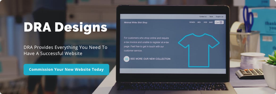
This is when you move into the 'benefit-driven CTA' which shows your visitor where they are going.

All of this text can be within a clickable banner advert, or just the 'Show Me More' can be clickable.
2. Don't give too many instructions
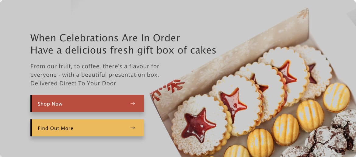
A common problem is not focusing on what you want the outcome to be, and over thinking all the possible solutions the visitor may want. It makes the CTA too long and confusing. Asking a visitor to do more than two things just means they don't know which action to take or why.

Here the potential visitor is being pulled between shopping now, which is what the seller really wants them to do, and finding out more. It's best to take the visitor to the shop where there will be additional product information that will turn them into a paying customer.
3. Embrace action words
Convincing users to take action depends on many factors, from how attractive your offer or product is to the appeal of your design and text. But a good action-oriented CTA can go a long way to giving your visitors that extra little push they need to click. Start your CTAs with a verb - an action word that helps to sell users on the benefit of clicking.

4. Match the tone and voice of your text
Your CTA should tell the same story as the rest of your text - use the same language to do it. If you use a different tone the visitor can become confused or feel if they click then they will end up on someone elses website.
5. Don't try too hard to sell
Ultimately we need to sell to our visitors, there isn't any other point to a website if visitors are not becoming paying customers. But trying too hard can put people off.
The best way to sell is to show off a product or services merits by describing them then giving the call to action. Often 'Buy It Right Now' only works when a regular customer loves you so much, they just have to have your products the minute they are launched. Personally the only word my favourite brand has to use on me is 'CAKE', and I'm there.
Whatever type of CTA you decide to use, even 'click here'. Measure it, if it isn't being clicked try something else until you find the ultimate wording, font and colour that attracts your visitors to carry out the action you desire.


